

How to Build a Small Home Decor Vignette with Framed Ferns
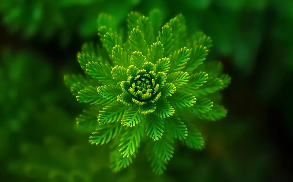
There is a particular kind of wall that never quite gets decorated: the narrow strip above a hallway console, the slice of plaster beside a bookshelf, the space above a small desk that is too shallow for a gallery wall and too empty to ignore. This is where framed ferns earn their keep. A fern print carries detail without noise. It reads as green even when it is sepia, and it holds a room together without asking for a colour scheme. The trick is not the prints themselves but the arrangement around them — the shelf, the cloth, the light. Build those three things well and a metre of wall starts to feel intentional.
Start With the Surface, Not the Art
Measure the furniture first. If the vignette sits above a console or sideboard, the framed group should span roughly two-thirds of its width, leaving breathing room at each end. Anything narrower looks orphaned; anything wider looks like it is sliding off. On a surface 90 cm wide, that means a picture group of about 55 to 60 cm. Write the number down and take it frame shopping, or take it to the drawer where your unmounted prints are already waiting.
Height matters just as much. For a piece viewed while standing, the centre of the group should sit at roughly eye level — a little above if the ceiling is high, slightly lower in a room with low ceilings. Over a desk or bedside table, drop it 10 to 15 cm so it sits comfortably in the sightline of someone sitting down. Fix these two numbers before you touch a hammer and the rest of the decisions get easier.
Build the Frame Group on the Floor First
Lay the frames flat on the floor or a large table and shuffle them until the group looks settled. Three is a reliable number for a small vignette: one hero print, roughly A3 or larger, and two smaller companions. Odd numbers give the eye a centre to land on. If you only have two prints, hang them as a tight pair with a consistent gap of 5 to 7 cm and let the vertical stack do the work.
Sizes, mats and frames
Keep the mat proportions consistent even when the frame sizes differ — a 4 cm mat on all three pieces will make mismatched frames look deliberate rather than accidental. Ferns are delicate subjects, so generous mats suit them: the white space mimics a herbarium sheet. Frame finishes are a personal call, but a simple rule is to choose one family and repeat it. Pale oak and off-white read soft and natural. Thin black frames give pressed specimens a scientific edge. Brass looks lovely but throws a reflection, so skip it directly opposite a window.
One practical note: if the wall faces a bright window, ask for non-reflective glass or accept that the fern will be partly a mirror for half the day. Standard glass is fine on a side wall that only catches indirect light.
Layer the Shelf With Three Heights
Now the surface. The instinct is to fill it, and the result is usually a cluttered line of objects at the same height. Think in three layers instead: something tall and vertical near one edge, a low cluster in the middle, and a small object that breaks the line at the other end. The framed ferns on the wall provide the upper layer; the shelf only needs to echo them.
- Anchor tall. A slim vase with two dried stems, a stack of three art books standing upright, or a table lamp. Place it off-centre, roughly a quarter of the way in from one end.
- Go low in the middle. A small dish, a candle in a plain holder, a single ceramic vessel. Keep it under 12 cm so it does not compete with the frames.
- Leave a gap. Aim for about a third of the surface to stay empty. Empty space is what makes the objects look chosen.
- Repeat one material. If your frames are oak, bring one more piece of wood onto the shelf. If they are black, let a dark ceramic or a dark book spine answer them.
- Mind the lean. Anything propped against the wall should overlap the frame group slightly — a few centimetres is enough to tie the two layers together.
Add Textiles for Warmth, Not Pattern
Framed botanical prints are graphic. They are mostly line and silhouette. Textiles soften that, but a busy print will fight the ferns for attention. Choose texture over pattern: washed linen, raw cotton, a folded wool throw, a runner with a visible weave. A linen runner across a console does more for a vignette than any three objects placed on top of it.
Colour is the other lever. Pull one tone out of the ferns — the deep green of the frond, the cream of the paper, the brown of the ink — and repeat it in the cloth. A sage-grey linen under sepia prints, or an off-white runner under deep green cyanotypes, keeps the display reading as a single thought. Drape, do not spread; a cloth that hangs over the front edge by 10 cm softens the hard line of the furniture. If the surface is glossy or dark, this also breaks up reflections.
Light It Like a Small Gallery
Lighting is the step most people skip, and it is the one that decides whether the vignette looks like a display or like a pile of nice things. A small picture light above the frame group — cordless rechargeable versions exist now and avoid the cable problem entirely — will pull the ferns forward from the wall and give the shelf objects a shadow to sit in. Choose a warm-white bulb, somewhere around 2700K, and keep it dim enough that you notice the light rather than the fixture.
If a picture light is not possible, work with what the room already has. Angle a floor lamp so it grazes the wall from the side; the raking light will show the texture of the paper and the weave of the linen. Avoid pointing a lamp straight at glass, which produces a bright rectangle and hides the print. And keep real candles well away from anything that hangs above them — a small, obvious point that is easy to forget once a vignette looks finished.
Rotate the Contents, Keep the Skeleton
Once the structure works, leave it alone and change only what sits inside it. Swap the two smaller fern prints for a different pair every few months, or replace the middle shelf object with something seasonal — a small bowl of hips in autumn, a single stem in spring. The frame positions, the runner and the light stay exactly where they are. This is the advantage of building a skeleton: you get the pleasure of change without redoing the measuring and the nail holes.
Before You Hang Anything: A Five-Minute Check
Run through this in order and you will avoid the two most common regrets — holes in the wrong place, and a group that looks smaller on the wall than it did on the floor.
- Cut paper templates to the exact size of each frame and tape them to the wall at the planned height.
- Step back to the doorway and look. If the group feels small, add a frame rather than enlarging the gaps.
- Check the gaps: consistent spacing between frames, wider space to the furniture edges.
- Confirm the hanging hardware suits the wall — plasterboard needs the right fixings, brick needs a masonry bit.
- Hang the centre frame first, then work outward, checking level after each one.
Then put the kettle on, sit down opposite the wall, and look at it for a minute without adjusting anything. If your eye travels from the fern to the shelf to the light and back without snagging on a gap, the vignette is doing its job. Small displays like this rarely need more; they need less, arranged with a little care.
Photo: bkrmadtya / Pixabay